The low-iq democrat sheep are able to distinguish between legitimate and bullshit science by listening to what Joy Reid tells them.
If it isn't science denial it's racism.
- Next Best Thing
- Yesterday, 04:42 PM
- brasil
- Yesterday, 06:08 PM
https://co2coalition.org/facts/for-m...er-than-today/I know I should not bother responding to this. The same argument was made to me by my dentist about 20 years ago. I did not bother to argue with him, since he had a drill in my mouth at that time.
Originally Posted by Flair4Drama
In the absence of a drill, let me point out that:
1.Your graphs are not wrong. But what some of the readers of this thread may not understand (or choose to ignore) is that those graphs represent millions of years of climate change based on non-human events. (Indeed humans were not even around for almost all of that time.)
2. Climate scientists are, of course, not oblivious of these historical cycles. I don't know why you seem to think they are.
3. What is happening over the last 60 years or so is an ahistorical acceleration of planet warming. In other words, based on the historical trends summarized in the graphs you have posted, the planet should not be warming at any where near the rate it is now.
4. The cause is easily identified as the greenhouse gases effect. (I'm not going to insult your intelligence by going into an explanation of that. If in doubt, consult other sources.)
5. Greenhouse gases are caused by burning fossil fuels, oil and gas most prominently among them.
The global warming that is happening today is not a gradual warming over millions of years, as was the case in past cycles. It is a rapidly occurring disaster with identified human causes.
If we go back to sleep for another 40 years (or even 10) without doing something about it, we will wake up to a rather uncomfortable world.
- JONBALLS
- Yesterday, 06:29 PM
rrRight
- JONBALLS
- Yesterday, 06:30 PM
rrRight
- Unique_Carpenter
- Yesterday, 06:37 PM
So... humans are actually Boglodites devouring the plant?? /s
- Unique_Carpenter
- Yesterday, 06:37 PM

- rooster
- Yesterday, 06:57 PM
I know I should not bother responding to this....First sentence is true. And the denial following it was certainly predictable.
1.Your graphs are not wrong.... Originally Posted by brasil
But your point about the graphs...gotta disagree. You give these geniuses and their naive, gaslighting arguments too much credit.
The graph is a piece of shit.
First, the "timeline" shown on the bottom is not linear, i.e. the space given to the "Icehouse" period of 3.64 million years is roughly the same amount of physical space given to the "Ordovician" period of 73 million years. That is just plain bad scientific technique. It distorts the timeline physically and makes the "Icehouse" time period look longer than it really is.
It is completely misleading and shows data out of context that proves nothing. But hey...it sure looks kewl, right?
The second problem is where this turd comes from. The "CO2 Coalition" a garbage, junk science site that even the Marshall Institute ended up disavowing. The CEO is a former CEO of the American Petroleum Institute, which gave them much of their funding. No biases or influences there, though, I'm sure.
In their "analysis" of the graph, the site uses simplistic language and misrepresentation to take advantage of how little the general public knows about climate....and hard science in general. Despicable. But all too common these days.
Plain and simple, this is not a peer reviewed, vetted article.
If you submitted this in your High School Earth Science class, you would probably get a "D" grade.
You boyz been suckered again. But yer dug in so far now that there ain't no fuggin way yer gonna admit it.
It's getting really old.
And boring.
.
- The_Waco_Kid
- Yesterday, 07:08 PM
I know I should not bother responding to this. The same argument was made to me by my dentist about 20 years ago. I did not bother to argue with him, since he had a drill in my mouth at that time.there is no global warming happening. and greenhouse gasses are not only due to emissions. deforestation causes this at high levels.
In the absence of a drill, let me point out that:
1.Your graphs are not wrong. But what some of the readers of this thread may not understand (or choose to ignore) is that those graphs represent millions of years of climate change based on non-human events. (Indeed humans were not even around for almost all of that time.)
2. Climate scientists are, of course, not oblivious of these historical cycles. I don't know why you seem to think they are.
3. What is happening over the last 60 years or so is an ahistorical acceleration of planet warming. In other words, based on the historical trends summarized in the graphs you have posted, the planet should not be warming at any where near the rate it is now.
4. The cause is easily identified as the greenhouse gases effect. (I'm not going to insult your intelligence by going into an explanation of that. If in doubt, consult other sources.)
5. Greenhouse gases are caused by burning fossil fuels, oil and gas most prominently among them.
The global warming that is happening today is not a gradual warming over millions of years, as was the case in past cycles. It is a rapidly occurring disaster with identified human causes.
If we go back to sleep for another 40 years (or even 10) without doing something about it, we will wake up to a rather uncomfortable world. Originally Posted by brasil
the so called hockey stick graph was based on flawed data and in some cases fabricated data.
so .. be careful here .. trick question coming up ..
should we eliminate all CO2 in the atmosphere?
- brasil
- Yesterday, 09:25 PM
First sentence is true. And the denial following it was certainly predictable.What Rooster is pointing out is of course true. The graphs are not accurate. When I wrote that "the graphs are not wrong", I was referring to the fact that there have been cycles of warming and cooling throughout history even before humans came along. The graphs do illustrate that, however, inaccurate they are in depicting the duration of the different cycles. The takeaway point is that human activity is heating up the planet in a few years that took millions of years to achieve in other periods.
But your point about the graphs...gotta disagree. You give these geniuses and their naive, gaslighting arguments too much credit.
The graph is a piece of shit.
First, the "timeline" shown on the bottom is not linear, i.e. the space given to the "Icehouse" period of 3.64 million years is roughly the same amount of physical space given to the "Ordovician" period of 73 million years. That is just plain bad scientific technique. It distorts the timeline physically and makes the "Icehouse" time period look longer than it really is.
It is completely misleading and shows data out of context that proves nothing. But hey...it sure looks kewl, right?
The second problem is where this turd comes from. The "CO2 Coalition" a garbage, junk science site that even the Marshall Institute ended up disavowing. The CEO is a former CEO of the American Petroleum Institute, which gave them much of their funding. No biases or influences there, though, I'm sure.
In their "analysis" of the graph, the site uses simplistic language and misrepresentation to take advantage of how little the general public knows about climate....and hard science in general. Despicable. But all too common these days.
Plain and simple, this is not a peer reviewed, vetted article.
If you submitted this in your High School Earth Science class, you would probably get a "D" grade.
You boyz been suckered again. But yer dug in so far now that there ain't no fuggin way yer gonna admit it.
It's getting really old.
And boring.
. Originally Posted by rooster
- The_Waco_Kid
- Yesterday, 09:41 PM
What Rooster is pointing out is of course true. The graphs are not accurate. When I wrote that "the graphs are not wrong", I was referring to the fact that there have been cycles of warming and cooling throughout history even before humans came along. The graphs do illustrate that, however, inaccurate they are in depicting the duration of the different cycles. The takeaway point is that human activity is heating up the planet in a few years that took millions of years to achieve in other periods. Originally Posted by brasilwrong. but since you like incorrect graphs .. you'll love this one
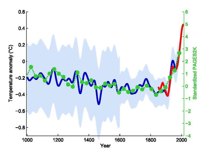
according to this graph the temperature will rise globally over 5 degrees by 2000
what year is it now?
2024. been waiting 24 years. still no spike. this graph is a "key" piece of the climate lie.
- Flair4Drama
- Today, 06:16 AM
In all fairness to Walz, he clearly didn’t have the questions in advance