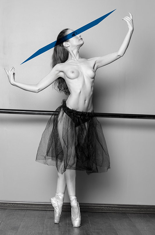
I would like to know how you can shade a certain area but not the other areas like what you are talking about! I tried to use the brush, but since I'm new I just get frustrated! I guess it's one of those times, you take a couple of breaths and just play with the burn/dodge! Instead of throwing the computer across the room...cause it's only half way like what you want it to be! :0What do you use for editing?
I just get so excited and try to edit to fast....smh I know, newbie gitters! Originally Posted by BDS
- DDBD Photography
- 02-25-2014, 04:54 PM
- john_deere
- 02-25-2014, 05:36 PM
I agree with john...a very nice shot but a little more fill would be nice. I still use some of my wedding presets on some shots like this and there are a few that would do the trick. I'll see if I can find them...yes I'm a preset cheat lol. Originally Posted by DDBD Photographydude, nothing wrong with using presets.....that's part of what makes lightroom so powerful, and when you have to process 100 images it's the only way to stay in the money.
- Adonis
- 03-02-2014, 08:22 PM
Pointe Taken:


- Col. Zodiak
- 03-02-2014, 08:30 PM
Due to several requests for clarification, this thread is not limited to photographs of escorts. A picture of any subject that you would like input on is more than welcome to be posted on this thread.
This will be added to the guidelines and highlighted.
This will be added to the guidelines and highlighted.
- john_deere
- 03-03-2014, 11:23 AM
- DDBD Photography
- 03-09-2014, 07:28 PM
- john_deere
- 03-09-2014, 11:34 PM
- Megan Love
- 03-17-2014, 06:24 PM
This is from my recent shoot....


- john_deere
- 03-17-2014, 11:21 PM
nicely lit, great colors....an all around good job, but i find the tilt distracting. it works for some compositions, and sometimes really adds a dynamic feel, but here it just seems gratuitous.
- Unique_Carpenter
- 03-17-2014, 11:27 PM
- Megan Love
- 03-18-2014, 08:56 AM
Thanks guys, this shot was taken Friday, March 14th in Alexandria Virginia. DC
- DDBD Photography
- 03-18-2014, 04:15 PM
Very nice. Great colors and lighting. The tilt is slightly distracting but it does not pull away from the image. I like that the blur is subtle. ..if it has to be done thats the way to do it.
- Megan Love
- 03-18-2014, 07:40 PM
Damn! I didn't notice the tilt, all-though I'm known for the tilt, I didn't plan this to be a typical Megan photo.
- Adonis
- 03-18-2014, 10:01 PM
I like tilts too... 

- Megan Love
- 03-19-2014, 08:38 AM
