What game is that? The incoherent comment game? The 9/11 deflection game?
Originally Posted by lustylad
Charts...Here is a simple Pie Charts for you chicken Hawk mutherfuckers that do not know how to follow the money. You welfare Defense Department chicken littles they use fear for more tax payers money!
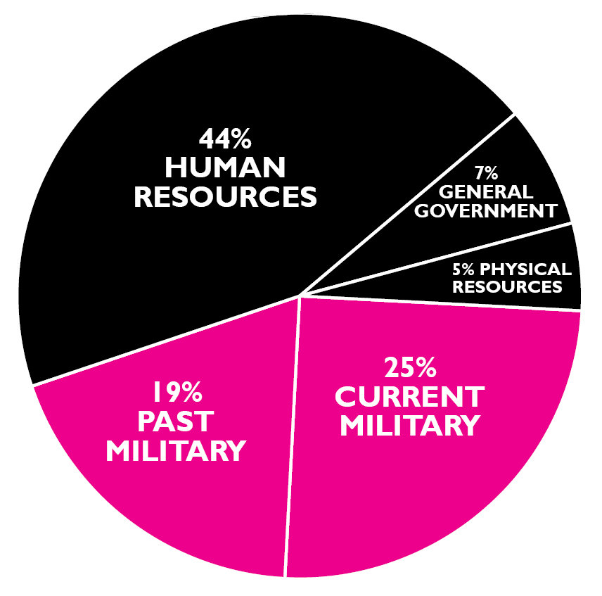
Pie Chart Flyers - Where Your Income Tax Money Really Goes
 BUY YOURS NOW Online!
The current edition of the War Resisters League's famous "pie chart" flyer, Where Your Income Tax Money Really Goes, analyzes the Federal Fiscal Year 2017 Budget.
(FY 2017 is 1 October 2016 - 30 September 2017)
BUY YOURS NOW Online!
The current edition of the War Resisters League's famous "pie chart" flyer, Where Your Income Tax Money Really Goes, analyzes the Federal Fiscal Year 2017 Budget.
(FY 2017 is 1 October 2016 - 30 September 2017). Perfect for Tax Day leafletting, as a focus for forums and panels and workshops and more!
Each year, War Resisters League analyzes federal funds outlays as presented in detailed tables in "Analytical Perspectives" of the Budget of the United States Government. Our analysis is based on federal funds, which do not include trust funds -- such as Social Security -- that are raised separately from income taxes for specific purposes. What you pay (or don't pay) by April 18, 2016 goes to the federal funds portion of the budget.
How Were the FY2017 Pie Chart Figures Determined?
Current military includes Dept. of Defense ($586 billion) and the military portion ($182 billion) from other departments as noted in current military box above. Past military represents veterans benefits plus 80% of the interest on the debt.* For further explanation, please go to warresisters.org.
These figures are from an analysis of detailed tables in the Analytical Perspectives book of the Budget of the United States Government, Fiscal Year 2017. The figures are Federal funds, which do not include Trust funds such as Social Security that are raised and spent separately from income taxes.
What you pay (or dont pay) by April 18, 2016, goes to the Federal funds portion of the budget.
The government practice of combining Trust and Federal funds began during the Vietnam War, thus making the human needs portion of the budget seem larger and the military portion smaller.
*Analysts differ on how much of the debt stems from the military; other groups estimate 50% to 60%. We use 80% because we believe if there had been no military spending most (if not all) of the national debt would have been eliminated.
Government Deception
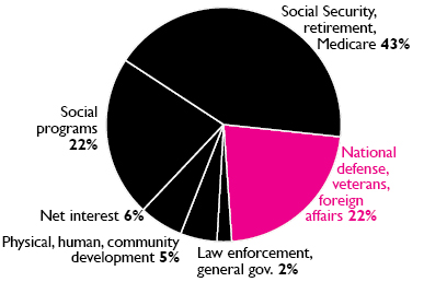
The pie chart is the government view of the budget. This is a distortion of how our income tax dollars are spent because it includes Trust Funds (e.g., Social Security), and most of the past military spending is not distinguished from nonmilitary spending. For a more accurate representation of how your Federal income tax dollar is really spent, see the large graph.
Pentagon Spending vs. Security
Presidential campaigns magnify the cries for more military spending. Candidates ignore the facts and declare the military has been gutted. They one-up each other on who will be the strongest commander in chief. The graph shows military spending at its highest levels since World War II despite recent declines. Look at what trillions of dollars and endless war have bought, then pledge to take at least one action below.


Originally Posted by UofHpc


 :thumbdo wn:
 :thum bdown:
 :t humbdown: